Showing posts with label Painting. Show all posts

04 July 2018

Aunt Sam - Happy Independence Day 2018!

Happy Independence Day from me, here, in the United States of America!  I was inspired to create something fun and unique today, since the holiday falls on a work day!  Please allow me to present Aunt Sam!

"Aunt Sam 2018"
graphite, watercolor, gouache, acrylic, and ink on watercolor paper, 5x7"
Completed 4 July 2018

I wanted to genderbend our well-known fictional representative and make her a cheeky, fun-loving lady (as opposed to the grump on the Army recruitment poster, lol).  I don't know where the idea came from, but once I thought of it, that's all I wanted to do for my 4th of July Twitch stream.  I think more than anything, the fact that this would give me a break from my February Gryphon illustration, which I've been working on diligently every day for the past few weeks, was what motivated me.


I ended up using an even wider variety of media than I originally planned.  My plan evolved as I worked and after finishing the graphite sketch and the watercolor, my use of the gouache with a stencil proved that I would need to use something else when adding more detail to the background.  I had intended to use gouache there too, but it was too bold and would have taken away from the main focus of the piece (Aunt Sam, that is).  So I switched to metallic silver acrylic!  I love the effect!  I definitely think it was the right move.  Everything else went as planned and I finished off the details with ink and more gouache.

Real time creation video of Aunt Sam 2018.

I had so much fun creating this piece (and chatting with one of my Twitch friends) that I ended up streaming for a full hour longer than scheduled!  And I didn't even notice my back hurting or my stomach complaining for food like I usually do.  I definitely needed this break :3  What a great way to start my long holiday weekend!  Happy Independence Day, everyone πŸ‡ΊπŸ‡Έ

P.S. Consider supporting my art career by purchasing this artwork as a print!  Available as art prints, mouse pads, mugs, and more! Click here to check it out :D

18 January 2017

ArtSnacks - January 2017

The folks at ArtSnacks helped get 2017 started on the right foot with the interesting, fun supplies they included in the January box. There were four different types of item--marker, paint, pencil, brush--but a total of five items thanks to the inclusion of two different paint colors. I'm here to share my unboxing with you, so let's check this stuff out!

Full Contents of the January 2017 ArtSnacks Box Laid Out 

Here's what's on the menu for January:
  • Kuretake ZIG Art & Graphic Twin RB+F Marker
  • GOLDEN High Flow Acrylic Paints
  • Princeton Snap! Series Paintbrush
  • Koh-I-Noor Magnum Black Star HB Graphite Pencil

Kuretake ZIG Art & Graphic Twin RB+F Marker

Kuretake ZIG Art & Graphic Twin RB+F Marker Test Page

I've now been introduced to so many ZIG tools throughout my years with ArtSnacks that I'm always happy to receive their products because they're always good. This marker's title is long but aptly describes it. “Art & Graphic” is self-explanatory, “Twin" indicates that it has a different tip on either end, and "RB+F" describes those tips: real brush and fine. The marker uses water-based dye ink and the 037 Persian Blue color I received is quite beautiful. I found that the brush tip laid down color fairly evenly when used with a light hand and produced an interesting dry brush texture as I pressed harder. I didn't test it, but I think dipping the tip in water would allow it to create large lines without the dry texture, perhaps making it useful for filling in relatively large areas with color. The fine tip, on the other hand, gave me a steady line that didn't waver in thickness. Since the ink is water-based, I ran a water brush over marks made with both tips as well as running the marker tip over a damp section of paper. All of these tests produced different, cool effects that would be useful in artwork, especially if the artist knew what look they wanted to achieve ahead of time (or was simply making an experimental piece).

GOLDEN High Flow Acrylic Paints

GOLDEN High Flow Acrylic Paints and Princeton Snap! Brush Test Page

I was surprised to find two full bottles of the GOLDEN paints in my box and was pleased to read on the Menu that it wasn't a mistake. How generous and fun to send us two different colors to play with! I received two fluorescent colors: green and chartreuse (yellow, to my eyes). These paints come in squeeze bottles (be sure to remove the protective seal under the cap before squeezing or you might end up with an explosive mess on your hands, literally) so they can be used straight from the nozzle or poured out for use in everything from refillable markers to airbrushes. For my part, I tried them straight from the bottle, with a dip pen and with the Princeton Snap! brush and water. The paints performed admirably in all applications and my colors in particular looked really cool swirled together with water on a blank watercolor postcard (pics at the bottom of the post!). The only problem I encountered was when digitizing the dried postcard: it took a good deal of color adjustment to get the digital copy to read well. I'm sure it was an issue caused by the bright hues and not by the paint in general.

Princeton Snap! Series Paintbrush

I don't have many filbert brushes and I didn't have any in size 4 so I was happy to receive this one. In the days I spent testing it out on various little projects, I've washed it many times, sometimes quite roughly, but haven't had a single bristle fall out. To me that's an indication of a well-made piece of equipment. Aside from the bristles, I think the attractive finish on the handle is further evidence of the brush's quality: at the right angle, it's possible to see a shadow cast on the wood by the letters printed on top of the clear varnish. That kind of detail is so satisfying! In action, I could find nothing to complain about with this Snap! brush; the bristles held a reasonable amount of pigment and laid it down evenly and smoothly. The filbert shape allowed me to create both wide blots and relatively thin lines, making this tool useful for multiple applications.

Koh-I-Noor Magnum Black Star HB Graphite Pencil

Koh-I-Noor Magnum Black Star Graphite Pencil Test Page

It's hard to get too excited about any graphite pencil but this Koh-I-Noor has proven to be a satisfactory example, gliding smoothly across the page, stippling, lining, and shading with ease. The latter is probably this particular pencil's forte, since it's much fatter than your average drawing pencil. The chubby body also makes the Magnum very comfortable to use. The only drawback here is that the large size requires a larger sharpener (or the more risky knife-sharpening method) which luckily is not an issue for me, thanks to the wide variety of sharpeners I've obtained from previous ArtSnacks boxes over the years.

Goodies & Bonuses

As with every monthly ArtSnacks box, this one included some extras: the Menu, a list of all the tools and their descriptions (plus a wonderfully cheesy art riddle); an information pamphlet from GOLDEN about the High Flow line of paints; an ArtSnacks sticker (my pencil shavings jar is getting prettier by the month!); and a yummy Life Savers candy :3 I don't know if I've ever said, but I am always pleased to receive an actual snack with my ArtSnacks~ I'm glad they send one every time!

Progress Shot of GOLDEN High Flow Paints Swirled on a Watercolor Postcard
I made a colorful mess!

Overall, January was a solid box, a great start for a fresh new year. I think my favorite item was the Art & Graphic Twin RB+F marker. I just love art markers, so I'm always excited to try new ones. The RB+F didn't disappoint and the color I received was beautiful, so it's a welcome addition to my collection. I was surprised how much I liked the High Flow Acrylics, too. I'm not a fan of acrylic paint in general, but the fact that these can be used with dip pens means they're not just acrylic paints for me. I rarely paint with acrylic but I use dip pens all the time. I'll remember these next time I want some trippy fluorescent linework. Heck, even the Snap! brush and Magnum pencil from this box, though basic, are still welcome additions to my supply horde. Who can't use an extra brush or pencil?
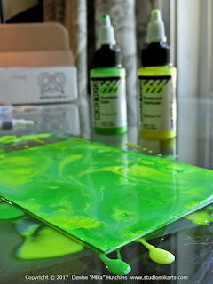
Close-Up Shot of GOLDEN High Flow Paints Swirled on a Watercolor Postcard
This was a really fun experiment~

I'm looking forward to what ArtSnacks will bring me throughout this year. If you received this month's box, let me know what you got and what you thought of it! Also, feel free to send me any questions about this box or its contents, I'd be happy to clarify anything I didn't already cover. Finally, if you did an ArtSnacks Challenge with the January 2017 supplies, link it in the comments so I can check it out!

I mailed the finished postcard to my good friend, Sarah.

11 January 2015

New Art - Companions

My first new art piece of 2015!  This painting was actually several years in the making, initially requested in 2010 or '11 (I honestly can't remember now), practice sketches done within the next year or two, pencil lines completed in 2013 or '14, and now the final steps of painting and inking are complete.  This blog entry will focus on those last steps which were undertaken in 2015.


The backstory to this painting is pretty simple: for his birthday, my beau asked me to paint him and myself as Doctor Who companions.  At that time, I was already getting into 10th Doctor (David Tennant) Doctor Who on my own because my local PBS station was playing episodes every week. My beau furthered my interest by introducing me to the 9th Doctor (Christopher Eccleston).  I've since watched every Eccleston episode and more than half of the Tennant episodes, but my beau remains the more fervent Doctor Who fan of the two of us (he's seen almost everything, I think, even the original episodes!).  Because of that, I felt pressure from myself to make this painting as good as possible.  Coupled with other time-consuming responsibilities, that pressure caused a lot of delay.  Whenever someone asks me for gift art, I have a harder time creating because I don't want to 'mess it up' (even when I'm reassured that they'll love whatever I come up with).  Sometimes this means I never finish the piece at all.  Lucky for this request, for the past few months I've been feeling really confident when I create--truly embracing any 'mistakes'--even when the result is meant to be a gift.  This is the biggest reason I was finally able to complete this piece.
 
Artist and Her Beau, in Watercolor
I've been really enjoying making "splotchy" watercolor, recently.

I feel like I have a photo somewhere of the graphite linework for this piece but it's too much trouble to dig through 2+ years of photos to find it now, ha ha.  I still have the original drawing, which I traced onto the paper pictured above, but I neglected to photograph it before starting in with paint.  All this means is that none of the work prior to what I did in 2015 will be pictured here.  In the photo above, I'd completed the first application of watercolor paint (starting with watercolor marker as a base in dark areas).  I focused simply on getting the main colors down on the figures, including only basic, rough shading.
 
Tracing a TARDIS onto the Painting
Google image search + Photoshop and my printer = TARDIS!

This next step, though simple, was actually a breakthrough for me.  One of the biggest challenges I faced while composing this piece was how to make it look like Doctor Who.  My first idea was to draw us inside the TARDIS and/or with the Doctor himself.  I quickly gave up on the Doctor (how to choose which iteration?! I hate choosing favorites, though I do have them...) and when trying to draw the inside of the TARDIS, I kept getting frustrated because the place is so complex.  I found it difficult to find an angle that matched our poses and looked recognizable without crowding the composition.  Not to mention that the inside of the TARDIS changes almost as often as the Doctor himself.  It wasn't until this year that I had the amazingly simple idea of tracing a police box in the background.  Such a relief to finally solve that puzzle!  Not to mention feeling a bit foolish for not thinking of it earlier.
 
Background Started
I'm in love with using sponges in my watercolor works.

The next steps I took involved more watercolor.  I used watercolor markers to paint the TARDIS.  By drawing with the markers first, then spreading the pigment around with brush and water, I was able to give the box some texture.  While going over the blue watercolor marker, I also pulled some of the color onto the figures of my beau and me in order to tie the fore- and backgrounds together.  I even painted the white parts of the TARDIS a little bit, just to make sure everything looked worked. 

The background was simple but took a long time to complete due to drying times (above, you may notice the page was still very wet when the photo was taken).  I started by wetting the entire background and dropping paint onto it.  I then swirled the page gently, to spread the color organically, and let it dry completely.  I repeated this process a couple more times, sometimes guiding the paint into small areas with a brush, and finished by daubing even more paint all over the background with a sponge.  All of this was to create something reminiscent of the purple-blue-black spacey backgrounds so often a part of Doctor Who imagery.
 
Stencils Added to the Painting
Stencils are awesome!

At this point, I began to add things that never would have happened if this piece hadn't been put off for so long.  The first is the use of stencils to create texture.  I simply took one of my organic-patterned stencils and painted over it, just to add visual interest to the background.  This is something I only started doing in 2014 and wasn't part of my technique back when this piece was first requested. 

Next, something that wouldn't have happened if I had completed this painting even a month earlier: the addition of Gallifreyan-like text.  To do it, I entered a Google image search to see what Gallifreyan is supposed to look like (rather than just making it up and hoping it was recognizable) and used an image result I liked as inspiration.  I just used one of my watercolor markers and a couple circle templates (the one pictured above is actually meant for quilting but it works awesomely for my purposes).  As I worked creating my own Gallifreyan message, I actually began feeling like, if I really studied, I could someday understand the language, ha ha.  By drawing it myself, rather than simply looking at those crazy-complicated scripts, certain patterns and rules began to appear.  That being said, I didn't try to write anything in particular here, ha ha.  If anything, I hope it reads "happy birthday" and not something rude, ha ha ha.

The reason I thought to add the text in the first place is my beau mentioned a couple weeks ago that a pageful of circles I had drawn for an art exercise looked "like Gallifreyan".  A few days later, I realized it could be a great way to add more Doctor Who to the entire piece.
 
Black Ink Being Added
Gel ink on the TARDIS, black ink to bring out the lineart.
White Ink Added
Finishing with white ink to add dimension.

The next step I took creating this piece is usually my last: inking.  I went over the TARDIS lines with glittery gel pen and inked its black parts with a dip pen.  I continued with the black ink on the foreground, going over almost all of the graphite lineart (I left some of it uninked; certain areas look better with only the subtle graphite lines) and adding hatching to enhance shadows or wrinkles.  I did the same thing with white ink after that, adding highlights to areas that were meant to shine (hair, eyes, shoes).

This was another step that took a long while due to drying times.  I would ink a small area, then wait for it to fully dry before continuing onto the next area.  The process was tedious but it helped prevent any smudges (though it didn't help drips!  Luckily, the single, substantial drip I faced was dealt with so well--if I do say so myself--that it's impossible to tell where it happened or how bad it was).
 
Close-Up of the Painting and Silver Acrylic Paint
Metallic paint, mm-hmm, who doesn't love metallic paint~?

As I said above, inking is usually my last step in a piece like this, but I was inspired by the paint I had received in the most recent Pigment+Palette box: metallic silver acrylic.  I wasn't able to use it in the way I originally intended (spattering over the page with a brush; it just didn't wanna! It foamed in the brush instead of flicking down onto the page, even when watered down or used on a toothbrush) so I went back to my sponge and stencils instead.  My vision of the completed piece was forced to change with the circumstances but I was still satisfied with the result.
 
Completed Painting
This birthday request has finally been fulfilled!

After the acrylic dried (goodness, I really love the way metallic media changes with the light; it's something digital art just can't replicate) it was finally time for the finishing touches.  I used several different ink pens to clean up little details throughout the piece.  More than anything, I went over the silver paint in certain areas to make it look like the lineart was showing through.  I had actually banked on the acrylic being translucent, so the final detailing ended up as an unexpectedly large task, though it was, of course, worth the effort.
 
Happy Birthday, Sean~!
Happy birthday!  Time for adventure!

I don't know if I'll ever get better at completing request art in a timely manner--that voice in my head which pressures me to make it perfect is the same voice which helps me improve my skills in general--but for now it feels great to have finished this one.  I'm proud and pleased to report that my beau already has the piece framed and mounted on a wall at home~

28 December 2014

New Art - Tea Ducks

For Christmas this year, two of my friends and I agreed to do an arts/crafts gift exchange.  For my part, I decided to create a triptych painting that highlights the biggest thing that brought us together throughout 2014: The Rubber Ducky Tea Society.  Every few months this year, we three met up for tea and always brought and used our tea ducks (a cute loose leaf tea infuser shaped like a rubber ducky which floats in your cup as your tea steeps).  These tea parties were fun and laid-back and brought the three of us together like nothing else ever did before.  This blog will show you how I went about commemorating those feelings and memories in paint.


I decided to make my triptych on watercolor postcards.  I even considered mailing the painted postcards directly instead of wrapping them like a normal gift but the risk of damage in transit is virtually 100% through the USPS (especially during the holidays; one Christmas card I received this year looked like the envelope had been filleted.  I was surprised it even made it to me, since my address was almost illegible) so I quickly decided against that idea.
 
Art Supplies Prepared for Drawing
Step one: watercolor postcards, mechanical pencil, and erasers.
Rubber Ducky Painting, Ducks Painted, Paints Pictured
Step two: watercolor paint.  The cards are taped together on the back.

The holidays this year were insanely busy for me, so I didn't have time to do any sketching before starting this project.  My composition was purely instinctual.  I started with one duck and added another and another until the pages were filled.  As I worked, I made sure that some ducks overlapped into the next postcard, so it would be clear that all three pieces were meant to fit together.  Once the pages started to fill out, I also decided to ensure there were two ducks per card.  The tiny duck in the middle right of the full piece is the last one I drew.
 
Rubber Ducky Painting, Ducks Painted
Rubber Ducky Painting, Ducks and Background Painted

Recently my watercolors have felt more satisfying when I paint more roughly (as opposed to precisely and smoothly) and then add ink for definition.  So my strokes on these cards are big and blotchy and very organic (especially in areas like the background where I used wet-on-wet techniques).  The paintings don't look anything like complete even when the painting part is technically done.  What brings it all together is the ink.
 
Rubber Ducky Painting, Watercolor Complete
Watercolor totally done.  Now for inking!
Rubber Ducky Painting, Detailing Complete
After using several pens and a watercolor marker, the triptych is complete!

I have to thank ArtSnacks again for the awesome tools I used to finish up this project.  I used the Twin Tip pen set that came in my 2014 Studio Collection (the scroll tip is just the coolest!) to outline the ducks, the metallic brush pen they sent in the November 2014 box to emphasize the bubbles, and the watercolor marker that arrived in the September 2014 box to add interest to the background.  The only non-ArtSnacks pen I used on this piece is my trusty, go-to Sakura Gelly Roll gel pen in white.  After finishing these paintings, all that remained was to decide which card would go to whom.
 

When these cards are all together, they seem equally great.  But when viewed individually, they don't necessarily look as good as one another.  I asked my beau to look at them and tell me which two looked the best alone.  His opinion matched mine: the top card was the weakest (mostly due to composition) so I kept that one for myself.  Of the three, I actually like the background on this one best.
 

The middle card I had already hoped would turn out strong because I wanted to give it to the friend I've known the longest, Krystal.  She was the one who really brought our trio together; if not for her, I don't think we would all have become mutual friends.  The middle card is a symbol of her position as the connecting bridge between us.  Out of all the cards, I think this one is the cutest (it has both the largest and the smallest ducks!).
 

The bottom card is actually my overall favorite of the bunch.  The background looks pretty good because I was finally figuring out what I wanted to do (some of this painting process was quite experimental) and the composition is definitely the strongest of all three.  Plus, it looks like the ducks are swimming!  I gave this one to the newer of my two friends, Katrina. 

I love doing art gifts for Christmas but, because I had so much to do this holiday season, I thought I wouldn't be able to do any at all this year.  I'm really glad The Rubber Ducky Tea Society decided to have an artsy gift exchange.  It allowed me to create some art for people I care about without adding a huge burden to my already heavy holiday to-do list.  More fun, less stress! 

Did any of you create or receive art/craft gifts this year?  What do you think of homemade presents like these?  Is there something you wish you'd receive from an artistic friend or something crafty you want to try out next time a gift-giving occasion comes up?

14 December 2014

New Art - Beary Christmas

It's been a long-standing tradition of mine to design my own Christmas cards once the holidays roll around.  This year I already dedicated Halloween to Kiba and Thanksgiving to Kiki (one year-end holiday per cat!) so Christmas fell to Bear--appropriate considering how big, fluffy, and winter-ready he looks!  I decided to feature him in a simple (but pretty!) watercolor illustration so that I could finish the art in time to produce, fill out, and mail the cards to my friends and family by Christmas.  The following shows and describes my progress on this year's Christmas card from initial sketches to final product.  Please enjoy!

 
I started with a composition already in mind, a very simple idea of Bear and a winter night's sky.  I can't remember for sure, but I think Santa came into it when I described the idea to my beau.  He said Bear should be watching Santa and I agreed.  It didn't complicate the illustration too much and it added a Christmas element where there wasn't one before. 
 
Beary Christmas Illustration Sketches

I feel a bit clever because, when it came to the moon, I looked up which phase it would be in on Christmas Eve night this year.  The waxing sickle I depicted in the final illustration is accurate to Christmas Eve/Christmas Day 2014!  I even flipped it from my initial sketch so that it would match my (and Bear's) location here in the Northern Hemisphere.  I also arranged Santa and his reindeer so that they evoke the image of a bow and arrow.  I didn't mean to imply anything in particular with this imagery, but I found it more satisfying to draw them with that in mind than to randomly throw them on the page. 
 
Beary Christmas Illustration Sketches II

A big thing that changed once I went to draw the final pencil lines is that Bear stopped being a chibi.  I originally envisioned him chibified the same way I drew Kiba and Kiki for their cards but it changed right at the very end of the research and planning stage.  I think it changed when I drew the reference sketch to map out what Bear looks like from behind while looking up.  That took so much effort (I had to get him to look up out the window without turning around to beg for pets, which was hard because I used my hand to take his attention to the window but then he would follow my hand back, hoping it would then pet him) that my mind got stuck imagining a more realistic Bear.  I didn't even realize that the change had taken place until I was done drawing him and about to start coloring. 
 
Pencil Lineart and Watercolor Marker Work

You may remember that I was really excited to receive a watercolor marker in one of my previous ArtSnacks boxes.  I was so pleased with it that I eventually bought two sets of six markers and my first time using them was on this piece.  I didn't color the entire work with them (and I only used four of the twelve colors I had) but they were an excellent way to lay down large areas of bold color and they blended perfectly with my favorite Sakura Koi watercolor paints (which I used to color the rest of the image).  These markers may become a staple to my watercolor process.  At the very least, they'll always remain on-hand in case I need them. 
 
Watercolor Work Nearly Complete
Watercolor Work Fully Complete

Once I finished painting with water and brush (and sponge), I went over the piece once more time with the watercolor markers to redefine and detail certain areas, such as the silhouettes of Santa and his reindeer.  Which reminds me...I had a bit of trouble drawing the reindeer in silhouette.  I think I got confused about which leg I meant to have doing what, so some of the poor things look a bit odd.  There was no way to fix them without starting over from scratch so, even though I recognized the flaws, I left them as they were. 
 
Details Done with Various Tools

After all the watercolor was laid down, it was time for my favorite part of my painting process: detailing!  I used a lot of ArtSnacks for this stage, including two warm grey Copic multiliners, the brown multiliner and Spica pens from my Copic sketch set (from the 2014 Studio Collection!), and the black paint marker I received in the December box (unboxing/review of the December box forthcoming!).  These things all worked fantastically well to start tying up the painting.  The only downside to any of these tools is that the Spica pen--which is a brilliantly sparkly ink--only really shines in the original painting.  There's no way to replicate the glittery effect in digital or printed copies. 
 
White Detailing Done With Ink
White Detailing Done with Gouache

The final steps I took to complete this piece involved detailing with white ink and white gouache (the latter came from my 11th Edition Pigment + Palette box).  For the ink I used a Sakura Gelly Roll gel pen and Deleter White 1.  When I first used this Deleter White ink months ago, it was, disappointingly, too thick to use with a dip pen.  Happily, the dip pen worked this time because I added a bit of water.  It wasn't so much as to make the ink look thin or transparent but it was enough to allow it to flow perfectly off the nib.  I suppose it's quite lucky that the ink looked a little dried out or else I wouldn't have thought to add water!  As for the gouache, I simply wanted to tie the painting together with a wintry texture.  Not anything specific, but something between snow and stars, I suppose.
 
Completed Beary Christmas Painting
All done!

Although this piece only took me a single day's work from thumbnails to signature, I still think it looks quite lovely!  I meant it to be really simple, but the organic painting process gave it a great level of detail and wholeness anyway.  There are some areas I'd do differently if I had to remake it, but there's nothing about this piece that doesn't look like another successful Christmas card illustration~
 
Beary Christmas Cards
Final step: painting printed on greeting cards and postcards.

It was a good thing that I decided to spend only a day creating my Christmas cards this year.  Digitizing the piece, putting it into card layouts (greeting cards and postcards), printing, shopping for more blank cards when I ran out, gathering addresses (I've come to expect friends to move sometime during the year without telling me), writing (I don't just scribble "Merry Christmas", I write a proper message!), stamping (including going out for a few international postcard stamps), and posting my 31 Christmas cards took almost two weeks!  All that effort seems to have been worth it since I've been getting very nice feedback from my friends and family.  Bringing happiness to people through my art is one of my overarching goals so it's extremely pleasing to hear that I've managed it with this piece~

I have one more blog post this week before Christmas, but I'm still going to use this space to wish all of my readers a very merry Beary Christmas (even if you don't celebrate; have a happy December the 25th❤) and a wonderful new year~!

16 November 2014

New Art - Happy Snow Girl

We've seen some extreme weather this week in Idaho, extreme not only in the type or strength, but extreme in the speed at which it came about, too.  When I was typing last week's New Art post, the weather was a bit chilly at night, yes, but very mild otherwise--dry, still, almost summery.  It definitely didn't feel like November!  Then, all of a sudden, last Thursday saw the arrival of an arctic blast that brought glacial temps and one of the biggest non-stop snowfalls I've experienced in all my time living here.  I LOVE inclement weather, so all of this has put me in a fabulous mood!  The painting I'm featuring today was created from those good vibes.


People who know me may recognize some of the features in the girl I depicted.  I wanted to create a pretty painting quickly, without too much thought about design or detail, while staying away from a wholly experimental composition.  It's easier to draw oneself, who one knows so well, than to create an entirely new character.  So, as you may see, my Happy Snow Girl was loosely modeled after yours truly. 

Anime-Style Girl Drawn on Watercolor Paper
Initial sketch done with a mechanical pencil.

This painting was actually created using several items from this month's Pigment+Palette box.  The first of which was a 4x6" piece of watercolor paper.  I want to save some of my review-like comments for my actual review post, but I will say that this paper was a joy to work with.  I was continually excited by how it took my brush strokes and how it reacted to the paint.  300 lb. cold press watercolor paper really is my favorite surface to paint on. 

Anime-Style Girl Filled In With Watercolor
Watercolor painted using the graphite as a guide.

Since I was in a bit of a hurry, I applied my watercolor more roughly than I'm usually wont to do.  The painting definitely didn't look complete after this step, but I knew how I was going to proceed, so that was a-ok.   My intention was to get the basic color and shading down with watercolor and add fine details with ink and gouache afterwards.

I used the whale tail brush from my P+P box to paint the lovely, mottled background.  The brush's organic result was just perfect for my wintry scene. 

Anime-Style Girl Outlined in Ink
The girl was lined using pen & ink.

The next-to-last step was adding lines.  This was where the painting really started to come together.  I used my favorite Deleter pen & ink system but I had to add a lot of water to get my ink to flow well; the cap to my ink bottle lost its protective wafer a while ago (well, it kept coming out and making a mess so I tossed it in frustration!) so the ink dries out unusually fast.  Thank goodness it performs just as well even after repeatedly drying up.  It's top quality stuff! 

Anime-Style Girl Completed with Gouache
Snowflakes and highlights were added with gouache.

At the end of this creative process, I used another P+P item: white gouache. I've never used gouache as a highlighting tool, but it seems perfect for use on a watercolor painting (after all, it's basically opaque watercolor).  I was able to add snowflakes, large and small, highlight the girl's face and hair, and fill in the heart details on her outfit.  This paint did everything I wanted and the resulting effects pushed the painting to a whole new level!  I'm beyond pleased~

Anyone else enjoying some wintery weather in their hometown?  Bundling up, sipping hot chocolate, throwing a snowball or two?  Are any of my fellow artists just as inspired by the sight of snow thickly blanketing the world?  Have you created something wintry already, too?

19 October 2014

New Art - Autumn Leaf

This new art post is also going to be a review of a couple items that arrived in my first Pigment+Palette box earlier this month.  One is a sample palette of QoR watercolor paints by Golden Artist Colors and the other is a bonus item, a water brush, that the P+P folks kindly included as a welcome gift.

So I had my sample palette, which came with six color daubs and a little square of watercolor paper to experiment on, and my water brush, which I was already generally familiar with thanks to the travel watercolor kit my sister gave me for my birthday earlier this year, but I wasn't sure what to paint.  I didn't want to do something random.  I wanted my painting--even though it was just a way to test these new tools--to look like something when it was done.  How could I use all the colors on this palette without making the final result look gaudy or unharmonious?

Watercolor Sample Palette with Sketch on Paper and Water Brush
Sketch in place.  Water brush filled.  Ready to paint!
 
My answer actually came from the watercolors themselves.  To my eye, the blue and orange stood out the most.  I realized that the entire palette was nicely balanced with complimentary colors.  This inspired the idea of depicting a colorful autumn branch against a bright blue sky.  I sketched the scene with a mechanical pencil then got to work using the color.

I used only the water brush, the watercolor palette, and the square of watercolor paper for the majority of the painting.  I did use graphite for the sketch and at the end I tried a bit of table salt to give the sky a touch of organic texture, but I didn't use any other brushes or watercolors.  It was actually a bit difficult to use only the water brush; it's great for covering larger areas but there's not much control over how much water comes out.  This means it's difficult to paint fine lines or maintain a rich streak of color.  It's definitely a brush better for initial color blocking or plain ol' sketching.  This isn't to say I don't like the item--it's a handy tool that I'll definitely reach for again--it's just got a specific set of limitations that's important to keep in mind.  The only real negative I noticed was that a couple bristles came out while I was using it.  The head hasn't fallen apart yet but I feel it probably won't last as long as a standard brush.

Watercolor Sample Pallet with Water Brush and Finished Painting
Finished painting.  Used about ⅔ of the water in the brush.
 
As for the watercolors themselves, you can see that they produced a beautiful, vibrant painting.  It was great that the sample palette came with a well in the middle so I could mix colors.  I was able to create shadowy tints by mixing compliments.  But despite the excellent color laydown, I won't be purchasing these paints any time soon.  Aside from the fact that I already have a favorite brand, I just couldn't stand the paints' unpleasant odor.  At first I thought something in the room was stinking, like a hidden spill needed cleaning or the trash needed taken out, but I eventually realized the odor was emanating from the watercolors themselves.  Maybe this smell is common to most watercolor paints (add this to the reasons my favorite brand is my favorite brand: no unpleasant odor from Sakura Koi) but it's not something I'm willing to accept.  I can handle some byproduct scents from my art tools, but this wasn't one of them.

I feel this came out nicely for a test painting.  The salt didn't really do much other than make everything sparkly but the colors stand out well enough on their own and the water brush did an admirable job even with its limitations.  I might use these watercolor samples again, smell and all, when I test out the watercolor board and water-soluble graphite stick that also came in the Pigment+Palette box.  Until then, let me know what you think of my test painting!  Was it a good use of the colors at hand?  Did you get this P+P box?  If so, did it come with this watercolor sample set?  What's your favorite watercolor brand and why?